
A refreshing social app where you find your soulmates by swiping memes.
MemeMatch
Project
Info
Role
UX Researcher
Product Designer
Timeline
September 2022 - March 2024
Tools
Figma
Adobe Illustrator
Adobe Photoshop
Firebase
Team
Stanisław Shelemekh
Bogumił Łuć
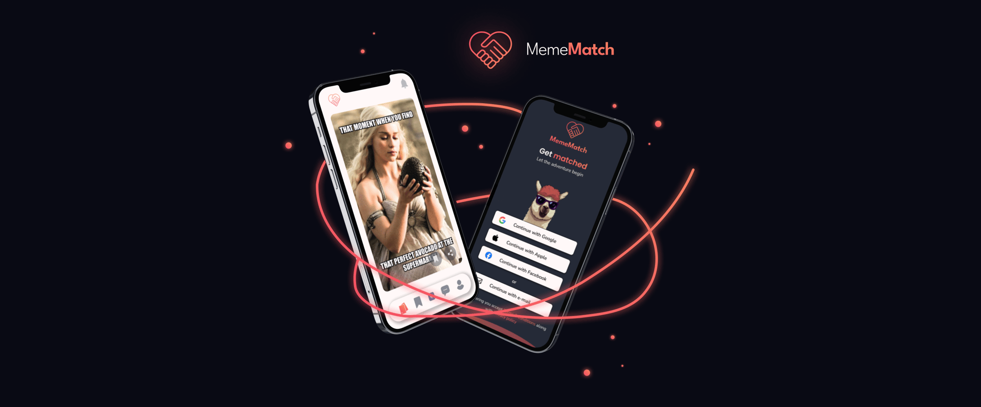
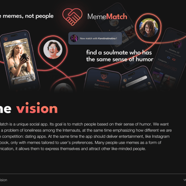
MemeMatch is a dating & social application developed by a small team in Cracow. In this app you are not judging people’s appearance, but funny memes instead. If you and the other person like the same memes - you’re matched! I joined the team early in the development stage and designed the new UI for public release. You can checkout MemeMatch here.
Overview
App was in MVP stage and needed a new upgraded UI before release. Also the team was planning to introduce monetization and needed to research and design new features.
The app has been released, downloaded more than 1.5K times and is highly rated by users. We've observed a steady increase in active user base count and user engagement.
Problem
Outcome
End result
Final application designs & solutions
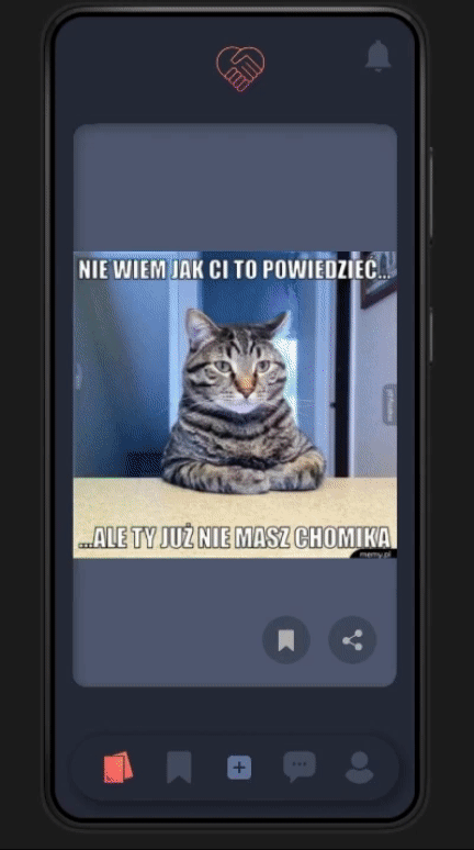
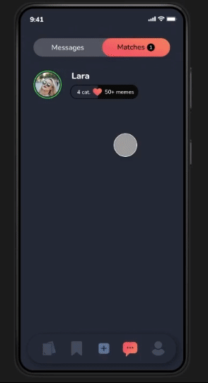
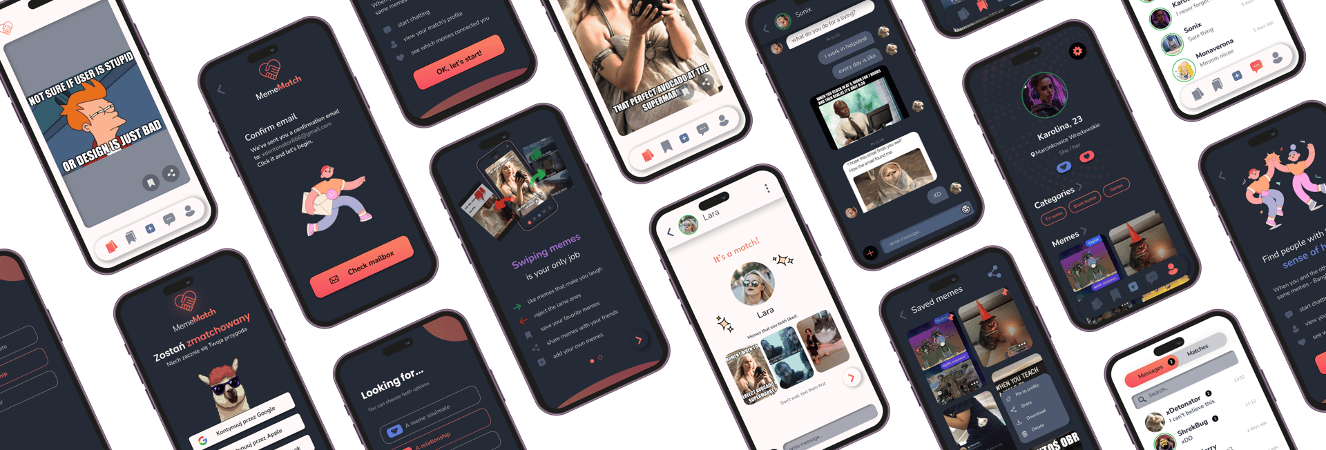
Swiping memes and chatting are main activities in the app. UI is kept simple to focus users' attention on viewing content. If person A likes the same memes as person B, they are matched and can message one another.
Swiping works the same way as in classic dating apps (like/dislike) so it's intuitive for majority of people. Users can save favorite content and create collections. The algorithm serves new content every day, adjusting to user's preferences.
After being matched, we can view user's profile and see which memes we both liked with the other person. This makes it easier to start a conversation.
It's also possible to match with people based on location/gender/age.
Design process
Research
1
user survey, personas, product discovery, feature voting
2
Strategy
competitors analysis, defining success metrics and revenue potential
3
Ideation
crafting user flows and lo-fi prototype, team brainstorming sessions, design iterations
4
Usability tests
moderated task-based tests with 10 new users, closed Beta testing with 300 users
5
UI design & branding
building a design system, hi-fi wireframes, designing brand visual identity
Discovery
The MVP version included core functionalities like:
- meme browsing
- an algorithm matching users based on their taste in memes
- a built-in chat
We reached out to people in meme-based communities as this is our main target group. We observed that these groups reported struggles with dating and socializing (via comments, memes etc.). The answers helped us discover users' needs and suggest possible solutions. Respondents were divided into 2 main segments based on their aspirations: relationship seekers & meme enthusiasts seeking entertainment. The second group would be our main persona as they were more eager to create content and engage in activities in the beginning.
Analyzing users, their needs & expectations
Online survey
MVP stage
I decided to analyze the surveys on a deeper level to get to know the users better. I built a Value Proposition Canvas to determine users’ pains and fears and what drives them when seeking relationships. This helped to visualize what potential features we could add to the product (and which to avoid...). We launched a feature voting page where users could report bugs, suggest new features and vote which ones they need most.
User voice
Insights
The onboarding seemed a bit too long. A few users had a hard time finding features. The initial interface provided no tutorials or examples for how to get started and some users were unsure what they should expect from the app.
Major issues and challenges
We quickly realized that pair-matching is not enough to keep users engaged on a daily basis. Since we had to stand out among other content viewing apps, users would need to feel a sense of belonging and gratification to build loyalty.
During Beta testing phase users reported problems with low quality of memes and categories not quite matching - these issues contributed to a decrease in user activity, hence it was the main topic in our discussions.
Discoverability
How to keep users engaged
Content quality
How can we improve meme browsing and matching experience to keep users engaged?
Working on solutions
Short and simple introduction
Main improvements
I reduced the onboarding steps from 8 to 5, making it easier to jump straight into the main content. A minimalist tutorial has been introduced and contextual menus added where they were expected. I redesigned the landing page, showcasing new features and the app's overview.
Building engagement
We've implemented 6 most desired features and it directly led to higher engagement statistics. In the future we plan to introduce gamification components to engage our main persona users in content creation and drive interactions in the community. It could also be a potential area for monetization.
Expanding content database
We analyzed Firebase data and gradually improved the algorithm, taking into account more statistics, e.g. popularity of specific memes (like/dislike ratio) and related tags. We sourced memes from new websites and a content administrator was designated to filter and accept images uploaded by users. With these steps satisfaction with memes has increased from 3.6 to 4.8 (5-star rating scale) and number of monthly matches went up by 17%.
UI Design
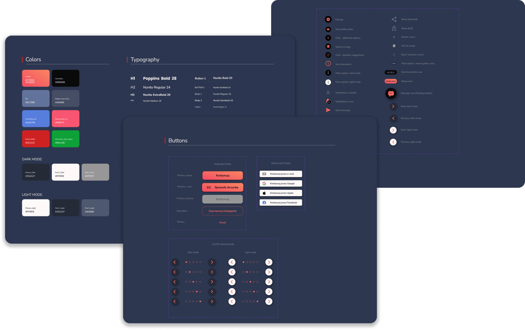
Design system
I've built the design system from scratch, cooperating with the main developer. We used some ready-made Flutter animations to improve the visual reception as there was no graphic designer in the team. App has been created with light and dark mode.

Branding 01
Building a brand identity kit
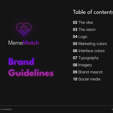
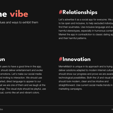
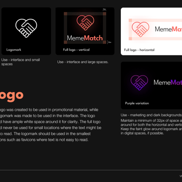
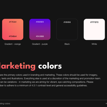
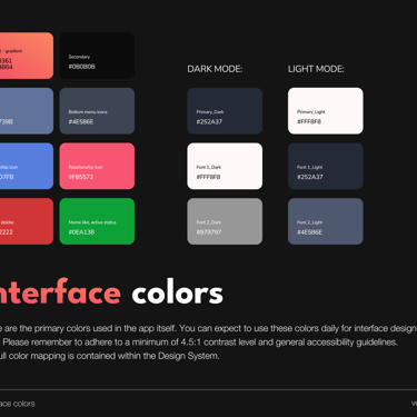
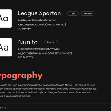
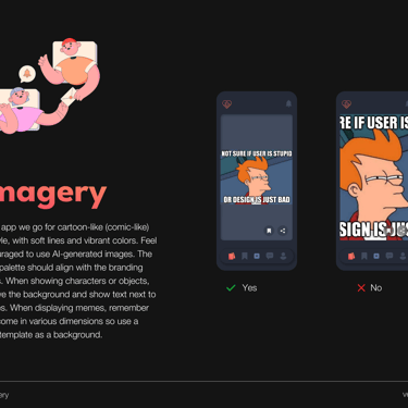
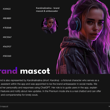
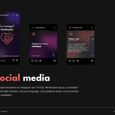
To support the rest of the design, I created a brand guideline kit. It contains tone of voice, logos, colors, type, iconography, imagery and product vision.
Branding 02
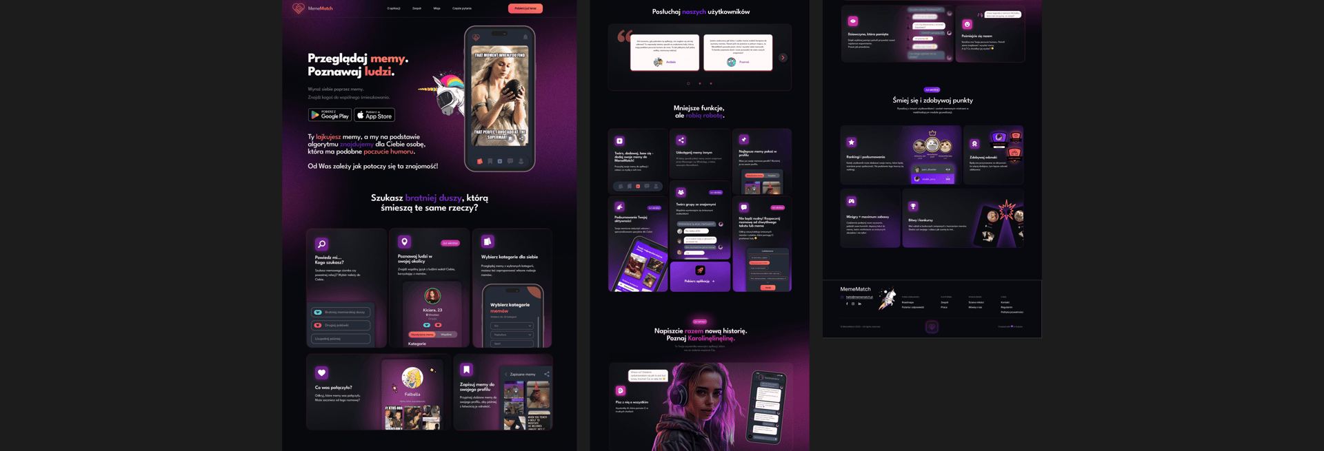
Landing page
With feedback I got from testing the existing site, I redesigned the landing page by making it more lively and consistent with new branding, adding social proof and feature presentation. After redesign metrics improved: +23% conversion rate, +34% average time on page, bounce rate -18%.
Results
01
Project outcomes
It was my first startup experience and being part of a cross-functional team that builds a product out of passion is priceless. A lot of great ideas were born during brainstorming sessions. I received feedback on my work, consulted different solutions with developers and effectively improved my UI design skills. I started to understand why some designs are not feasible and it's better to have a functional released product than a fully-polished design that is still to be implemented.
02
In January 2024 we released a public version and started building a community. User base is growing, users are actively creating new content, main KPIs have increased considerably. The app has been presented at Startup Stage and backed by KMS.